Landing Page Design for Small Business: The 7 Elements That Convert Visitors Into Customers
May 08, 2026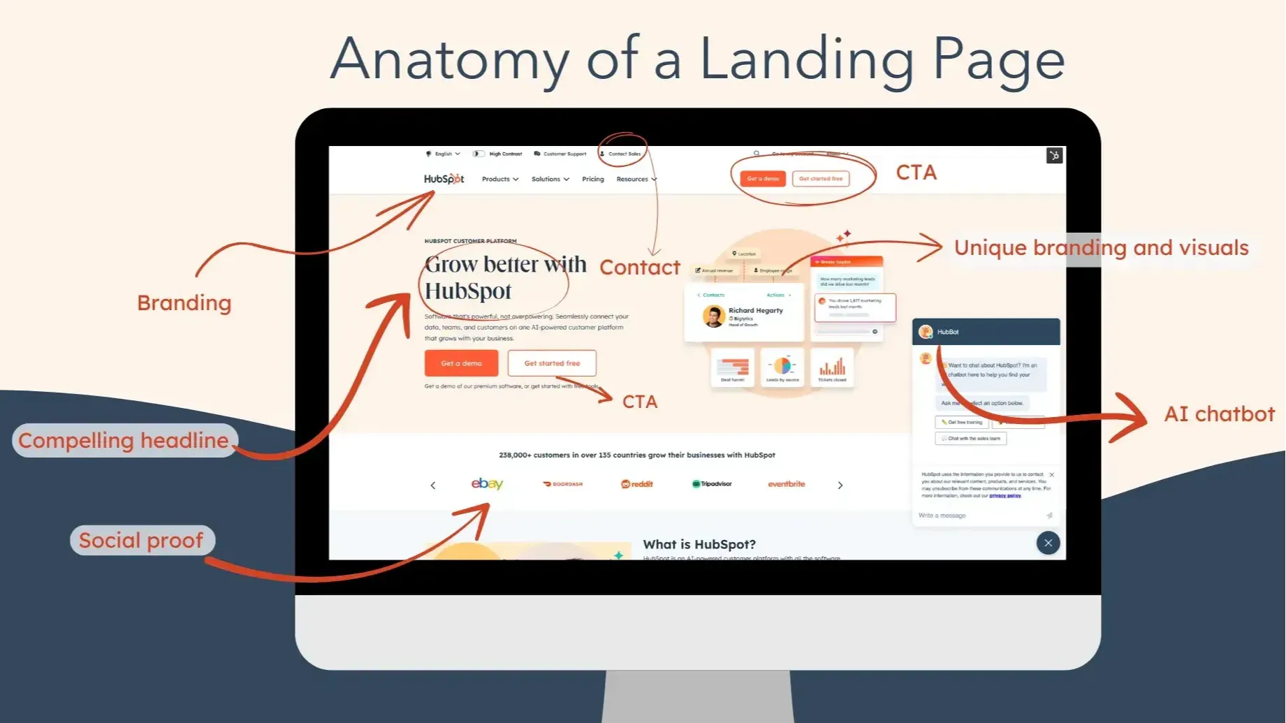
Last updated: April 2026 · Written by 20 Minute Marketing · 9 min read
A landing page is any page designed with a single goal: to convert a visitor into a lead or a customer. It's different from your homepage (which tells people who you are) or your service pages (which describe what you offer). A landing page is a focused, persuasive page with one job — to get the visitor to take one specific action.
Every small business running paid advertising needs landing pages. Every business running email campaigns that send clicks somewhere needs landing pages. Even organic traffic converts better when it hits a focused page than a general homepage. According to research by WordStream, businesses with 10–15 landing pages generate 55% more leads than those with fewer than 10. Here are the seven elements every high-converting small business landing page needs.
Element 1: A Headline That Answers "What's In It for Me?"
📘 Want the full picture? Read our practical marketing for small business — the complete pillar guide this article is part of.
Your headline is the first — and often only — thing visitors read before deciding whether to stay or leave. It has one job: to immediately communicate what the visitor will get and why it matters to them. The best landing page headlines follow one of these formulas: "How to [achieve desired outcome] without [the thing they fear]," "Get [specific result] in [time period]," or "The [adjective] way to [solve their problem]."
Examples for Kiwi service businesses: "Get a Same-Day Plumber in Wellington — Guaranteed Fixed Pricing" (plumbing), "Your Business Ranking on Page One of Google in 90 Days" (SEO services), "Renovate Your Kitchen for Less Than You Think — Free Quote in 24 Hours" (building). Be specific. Specific headlines outperform generic ones in virtually every conversion test.
Element 2: A Subheadline That Builds on the Headline
Your subheadline has 1–2 sentences to expand on the headline's promise and add a compelling secondary benefit or credibility statement. Example: Headline — "Get a Same-Day Plumber in Wellington — Guaranteed Fixed Pricing." Subheadline — "Available 24/7, fully licensed, with 4.9 stars from 312 Google reviews. No call-out fees. No hidden costs. Just fast, reliable help when you need it most."
Notice how the subheadline answers three unspoken visitor questions: How do I know you're good? (312 reviews, 4.9 stars.) How do I know you're reliable? (24/7, no hidden costs.) Why should I act now? (Fast, when you need it most.)
Element 3: Social Proof Above the Fold
Above the fold means visible without scrolling. Your social proof needs to be visible within seconds of the page loading. This is non-negotiable for trust. The most powerful above-the-fold social proof elements are: your Google review star rating with total count ('4.9 stars from 248 reviews'), a recognisable logo or two if you've worked with known brands or been featured in media, and one specific, short testimonial quote that addresses the main hesitation your target customer has.
Element 4: A Benefit-Focused Bullet Point List
Features describe what you do. Benefits explain why it matters. Use 4–6 bullet points after your headline to list the key benefits of your offer. Not features. Benefits. Bad: "We use the latest industry equipment." Good: "Solve your problem first visit — we carry 95% of parts on our truck so we fix it same day." Bad: "10 years of experience." Good: "Peace of mind from a team that has solved over 3,000 jobs just like yours." According to Nielsen Norman Group's research on web reading behaviour, people scan web pages rather than reading linearly. Bullet points are among the most-scanned elements on a page — make each one earn its place.
Element 5: A Single, Prominent Call to Action
Every landing page needs one primary CTA. Not a navigation menu. Not multiple options. One. The action you want the visitor to take. The CTA should be: visually prominent (a button in a contrasting colour), action-oriented ("Get My Free Quote" not "Submit"), benefit-focused where possible ("Start Growing My Business" not "Sign Up"), and repeated at least twice — once above the fold, and once after your main content.
If your CTA is a form, keep it short: name, email or phone, and one qualifying question (such as "what suburb are you in?" or "what service do you need?"). Every additional field reduces completion rates.
Element 6: A Clear, Compelling Offer
"Contact us to learn more" is not an offer. "Book a free 30-minute strategy call — you'll leave with a clear marketing plan for your business" is an offer. "Get a quote" is vague. "Get a fixed-price quote within 24 hours — no obligation, no surprise fees" is specific. The more specific and concrete your offer, the better it converts.
The most effective landing page offers for service businesses are: a free consultation or assessment, a free quote with a specific turnaround time, a low-cost introductory service, and a lead magnet (a free guide, checklist, or resource relevant to your service).
Element 7: Urgency and Risk Reversal
Urgency gives people a reason to act now rather than "come back later" — which usually means never. Risk reversal removes the reason not to act. Use urgency ethically and only when it's real: "We have 3 spots available this week," "This offer ends Sunday," "Book before Friday for same-week installation." Use risk reversal through guarantees: "Not happy? We'll come back and fix it for free," "Try our course for 30 days — if you don't see results, we'll refund every dollar," "100% satisfaction guaranteed."
Risk reversal is one of the highest-impact elements on a landing page for service businesses because the biggest barrier to enquiring is often fear: fear of being ripped off, fear of committing to something that won't work, fear of wasting time. A genuine, specific guarantee directly addresses these fears.
The Landing Page Checklist: Before You Launch
Run through this before any landing page goes live: Is the headline immediately clear about what the visitor gets and why it matters? Is social proof visible above the fold? Are benefits (not features) listed? Is there exactly one primary CTA, repeated at least twice? Is the offer specific and compelling? Is there urgency (if applicable) and risk reversal? Does the page load in under 3 seconds on mobile? Is there no navigation menu to distract from the main action? Answering yes to all of these means your landing page is set up to convert.
High-converting landing pages are covered in our Digital Marketing Essentials Course, including how to connect them to your Google Ads and Meta Ads campaigns for maximum ROI. For the website copywriting skills that make your landing page copy compelling, see our guide to writing website copy that sells. And for the complete funnel these landing pages sit within, our Five Pillars of Digital Marketing for NZ Small Business maps out exactly where conversion fits.
Get the complete digital marketing system built for NZ small business.
Join the Essentials Course →Want this taught properly in class format? our Digital Marketing Class.
Practical marketing, not theory.
20 Minute Marketing is the digital marketing course built for owners who need results, not lectures — short lessons, immediate actions, real outcomes.
Built for time-poor NZ small business owners.
You'll never need a Marketing Agency again!
Digital Marketing Courses that teach you more than an Agency ever could (or would!)